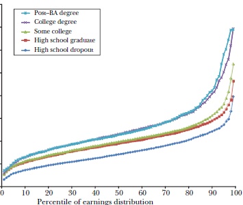
Here are two graphs of lifetime male income distribution broken down by educational attainment. One is for 1978, the other from 2008. I deliberately redact the years and dollar values to preserve the mystery.
Graph #1:
Graph #2:
Now you tell me: Without cheating by looking at the year, in which graph is “average over” – and why?
READER COMMENTS
Arthur B.
Dec 31 2013 at 11:04pm
No, but you see, freestyle chess & freestyle chess, so freestyle chess.
Did I mention freestyle chess?
Trent McBride
Jan 1 2014 at 12:12am
Ha! It’s like in Being John Malkovich, when Malkovich crawled inside his own head, and all he heard was everyone say “Malkovich”.
BC
Jan 1 2014 at 6:17am
First, an admission: I formulated an answer without “cheating”, but before deciding to post it, I did check to see which graph was which year.
Graph #2 is the one in which “average is over”. Relative to Graph #1, (1) there is more separation between the curves and (2) the separation grows wider at the higher percentiles. (1) suggests that there is more opportunity for individuals to distinguish themselves from “average” through education. (2) suggests that other factors besides education create even more opportunity for individual separation, i.e., some individuals do more with their education than others.
Nathan Smith
Jan 1 2014 at 10:13am
“Average is over” is the one where the lines are more spread out, and the lower ones are more crowded towards the bottom of the chart, because the vertical axis has been scaled further up to accommodate the high end.
Floccina
Jan 1 2014 at 12:26pm
I would guess graph 2. More people are in the well above average group so Tyler might perceive the difference more.
Tom West
Jan 1 2014 at 3:49pm
A thought provoking graph.
I kept searching for data points to confirm my priors on 1978 vs 2008 and found proof that that my biases are right, no matter which graph is 1978 and which is 2008.
Les Cargill
Jan 1 2014 at 4:55pm
Looks like a picture of the college premium, with an emergent premium for grad school.
Comments are closed.