All of that stated briefly, the low point for wealth concentration on Piketty’s chart (see the upward kink after the 1970s datapoint on Figure 10.5 above), and the point at which a supposed reversal in US wealth concentration trends begins, also corresponds to the period of the biggest decennial data gap in the Kopczuk-Saez data set. Despite this deficiency, Piketty’s 1970s average (again, based on only 2 data points in a decade that was also particularly notorious for its business cycle turmoil and economic fluctuation) is presented with a weight no different from prior decades in the 20th century where 10 full years of estimated data is readily available, or from subsequent decades where he switches, at least in part, to more complete supplemental data sets.
This is from historian Phil Magness, “Piketty Tricketty & Historical US Wealth Data,” May 25, 2014.
I’m reviewing Piketty’s book but have now read maybe 20 reviews of it without cracking the book. With all the controversy now about Piketty’s data, this will be a harder-than-usual review to write. I do find the above stunning though. The bottom line of the above is that Piketty took only 2 years of data for the 1970s to compute the shares of various groups for the 1970s.
Why does this matter? Here’s why. Magness writes:
The second begins to highlight the problems created by the uneven and sporadic distribution of source data that I just mentioned when Piketty constructs his decennial averages. By converting unevenly distributed root estimates into an evenly distributed decennial average, he ends up artificially creating a very pronounced “kink” in his Figure 10.5 [in the 1970s] with a clear downward trend predating it and an equally clear upward trend emerging from it over the next three decades. The political implication, of course, is that the unequal distribution of wealth in the United States is undergoing a consistent and uninterrupted rise towards levels unseen since at least the 1930s and will presumably continue beyond.
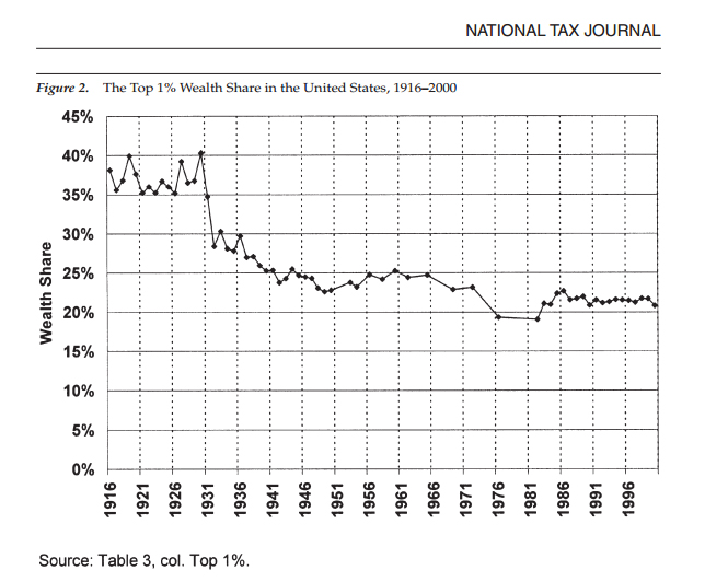
Contrast that with the yearly raw source data from which Piketty’s chart (at least through the 1970s, and then modified thereafter with supplemental sets) is directly derived and recalibrated. The aforementioned 1970s gap is readily evident, with no means of determining whether a the seemingly sharp drop in 1976 was in fact sustained throughout the sizable data gaps to either side of it, or to what extent it accurately captures the decennial figure Piketty then extracts for the 1970s.
Here’s the relevant table from a National Tax Journal article by Wojciech Kopczuk and Emmanual Saez that give the actual data on top wealth shares for each year, rather than giving an average over a decade.
READER COMMENTS
Daniel Kuehn
May 27 2014 at 1:14pm
This is recopied from where David asks me about this issue on my blog (here). I’ve been ducking in and out of this discussion, so perhaps I’m missing something but:
“I’ve been a little confused by some of Magness’s concerns, including this one. Let me say thought that I’d prefer to use annual estimates unless they’re really noisy (I don’t know if these are), and if they are use a moving average. I imagine the reason Piketty didn’t (and this is fine if the data are really noisy – perhaps less advisable if they’re not that noisy) is that you have these gaps and a moving average doesn’t make as much sense with the gaps. I suppose you could do a bigger moving average, but that might oversmooth.
Anyway what I really don’t get about Magness’s post here is that taking the ten year averages actually moderates the dip. The dip would have been deeper if he used the annual estimates. But instead of dipping down to a little above 19%, it’s much flatter at a little above 21% from the 1970s to the 1990s! So far from Magness’s claim that he is somehow overstating the point he seems to be presenting the data in a conservative way (at least when it comes to this period in the 70s).”
Daniel Kuehn
May 27 2014 at 1:26pm
I also find this claim by Magness that using multiple data sources (he calls it a “mishmash”) to get a tough measurement issue is “very odd” quite strange. That’s exactly what you want to do. I’m currently working on a project where I’m looking across four data sources to understand a small and poorly defined workforce precisely because you don’t want to trust a single source in these cases. You want to know the variability of the estimates and ideally (given what you know about hat went into each estimate), you want to use the different estimates to generate what you think is the most accurate picture.
Comments are closed.