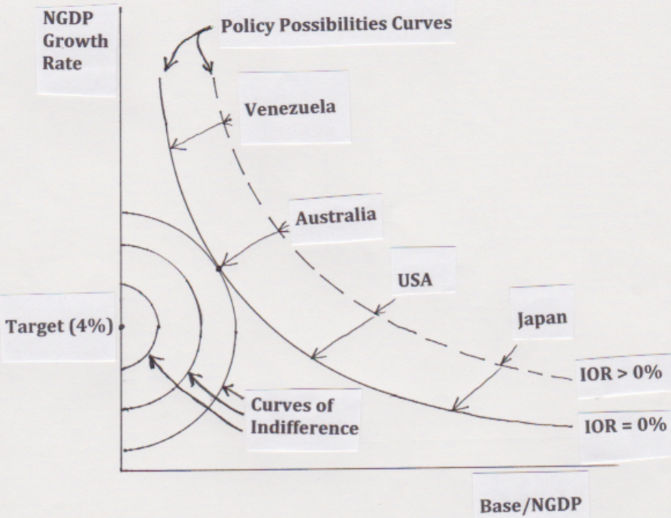
A few weeks ago I presented a graph that showed the trade-off between a big central bank balance sheet and faster NGDP growth:
Now I’d like to use this framework to discuss why so many people confuse easy and tight money policies. In the following graph, I’ve contrasted easy and tight monetary policies, over an extended period of time:
In the tight money case, the economy moves from point A to point B. This occurs as the central bank accommodates an increased demand for base money, by doing QE. The demand for base money is rising because the expected future NGDP growth rate is slowing—perhaps due to bad “signaling” from the central bank. This path reflects Japan during the 1990s and 2000s, or the ECB since 2008.
In the other path, an expansionary monetary policy is adopted, but it takes a while before it has any credibility. Initially, the central bank does the same sort of QE as the BOJ did in Japan, causing the Base/NGDP ratio to increase. But in this case there is a subtle difference. Now the quantity of base money is above the money demand curve, resulting in excess cash balances.
Over time, the excess cash balances leads to a hot potato effect, which gradually boosts the NGDP growth rate. As NGDP growth expectations rise, the demand for money (as a share of GDP) begins to fall, and you move from point C to point D.
The point is that the move from A to B looks pretty similar to the move from A to C. You can’t just look at variables such as the monetary base (i.e. QE) or nominal interest rates, and ascertain the stance of monetary policy. You need to look at NGDP growth expectations.
How does the central bank insure that you move from A to C, rather than from A to B? There are many options, including currency depreciation, NGDP futures targeting, level targeting, and a “whatever it takes” approach to open market purchases.
READER COMMENTS
bill
Oct 12 2016 at 12:02pm
Does anyone know why Bernanke said not that long ago that he thought the Fed should retain a large balance sheet? Maybe I misunderstood him.
Robert Simmons
Oct 12 2016 at 6:05pm
I’m sure it’s me, but how am I supposed to read this chart? (Guessing at numbers) The Fed is indifferent between 5% and 3% NGDP growth when the Base is 0? When the Base is say 5% of GDP it only wants 4% growth?
Scott Sumner
Oct 12 2016 at 7:48pm
Bill, I think he believed that more liquidity would make the banking system more efficient, but I’m not certain.
Robert, I assume the Fed is always indifferent between 3% and 5% NGDP growth, regardless of the size of the base. The second assumption is that they prefer a smaller base.
Recall that Bernanke pointed to “risks and costs” of a large Fed balance sheet.
Michael Makdad
Oct 13 2016 at 4:14am
In Japan the monetary base is in excess of 80% of NGDP but there is no hot potato effect observed among banks with excess cash balances — they would like to get rid of them but cannot. What is the mechanism by which the hot potato effect occurs?
Jose Romeu Robazzi
Oct 13 2016 at 8:42am
I believe that because of the money market funds structure, base money is indifferent to treasury bonds, so, in order to have a more effective “hot potato” effect the Central Bank should really buy private assets, offloading risk from the private sector
anonymous
Oct 13 2016 at 9:26am
“the Central Bank should really buy private assets”
I am all in favor of Scott Sumner but I confess I am not so sure this would not result in the central bank eventually buying the entire world.
Scott Sumner
Oct 13 2016 at 2:28pm
Michael, I don’t think the Japanese banks want to get rid of their reserves. If they did, they would.
Jose, I’d rather they set a higher NGDP growth target, so that they did not need to buy risky assets.
Anonymous, It seems very unlikely that the Japanese would be that lucky. Would the rest of the world really sell all our wealth to the Japanese, in exchange for worthless yen currency? What would we do with all those yen currency notes?
Robert Simmons
Oct 13 2016 at 3:48pm
Now I’m more confused about what the chart is supposed to show. Can you explain the indifference curves? Based on your reply they’re not for the Fed, so who’s curves are they? Why are there multiple indifference curves?
Jose Romeu Robazzi
Oct 14 2016 at 9:00am
Prof. Sumner, even with higher rates, technology of money market funds will still make indifferent for the public to hold either cash or t-bonds/bills. In that sense, monetary policy through t-bonds/bills is less effective, in my view, because one has to do a lot more of it in order to achieve some (hot potato) effect. On the contrary, holding private assets, which are not immediately interchangeable with cash, will offload risk from the private sector at a faster pace, giving the same amount of cash exchanged for them.
Comments are closed.